|
|
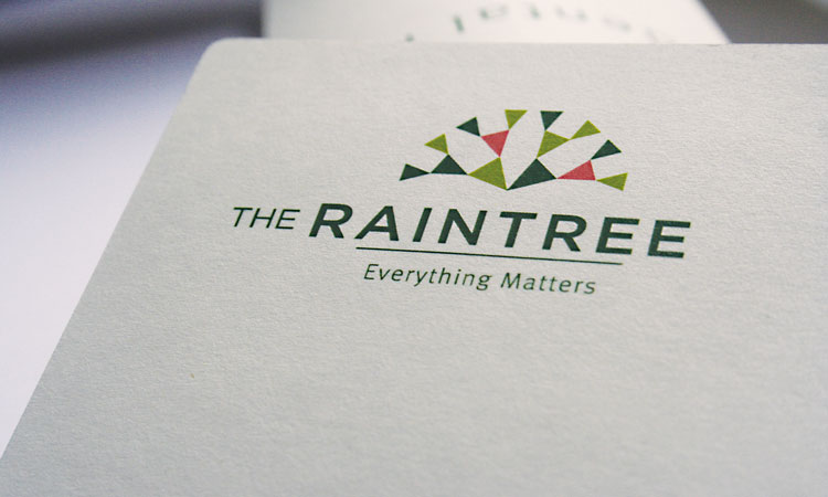
My project centered on the re-branding initiative of an eco-friendly business hotel- The Raintree. The company undertook the rebranding initiative because the current identity did not adequately reflect the basic values of an ecotel eco-awareness and sensitivity, business, hospitality, comfort and shelter. These values need to be summed up into one identity.
I was excited at the opportunity because it was not a conventional hotel. The new identity had to simultaneously incorporate all the following concepts: contemporary, abstract, organic, natural, sophisticated, suburban and high-end.
My project comprised three phases:
The first was research work which included field visits to other hotels, collections of samples like stationery and toiletries, analysis of the logo, their branding, position statements, websites, their values and comparison and evaluation of The Raintree against other hotels .
The second involved evaluating the usefulness and functionality of the ecotel label and coming up with alternatives, designing an identity, developing a positioning statement for the Raintree that has good recall value and giving it a brand personality.
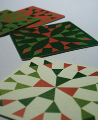
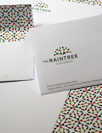
The third phase pertained to execution and refinement exploring and understanding materials and constructing prototypes to give a tangible shape to the concept. I realized that a hotel identity has to appear in a large variety of sizes and materials. I designed stationery, the covering for a dental kit, a shaving kit, a guest feedback form, coasters, matchboxes and door knob tags.
. Environmentally conscious graphic design tends to look rather rural so designing a sophisticated suburban mode of visual communication was exciting. |