  |
Young Designers 2011 |
|
| | | |||
 |
|
||
| Keywords Typography Type face Media Precision |
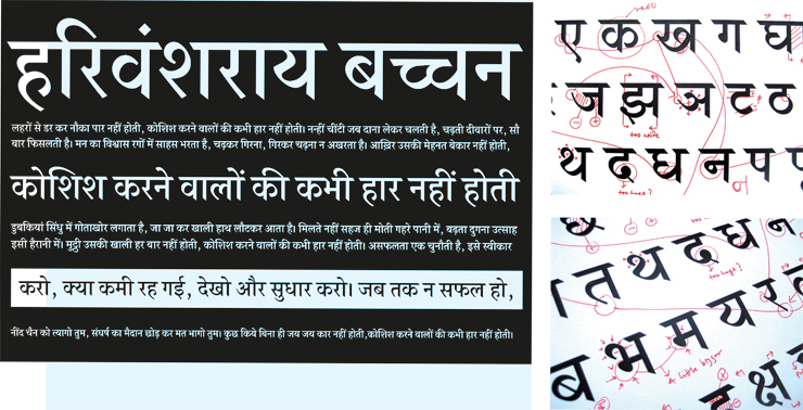
I had developed an interest in typography during my classroom projects and wanted to take it further with my diploma project. The project brief was to come up with a high contrast, high quality typeface for body texts, used in newspapers, magazines, etc. since there is a scarcity of good typefaces in this category. The initial process involved understanding the script. I delved into history books to study the origin of script and collected research samples to eliminate biases I had towards any style of writing. I started designing letter forms by writing down the letters in a guide-book meant for children. It took me back to my childhood. It was an immense learning experience as I understood the flow of each letter. Gradually, the project evolved from handwriting to the stage of controlled calligraphy (high contrast writing) and eventually to the digital medium. It also involved the learning of new software Font Lab, which dealt with precision. It helped me get into the nitty-gritty of a well-balanced and refined form. I also realised the significance of programming in the final stage of the project and how a good design could go wrong without it. After a multi-staged process that stretched a little over the stipulated timeline, I had a fully functional font. And though there still is a lot of work to do before the foundry actually releases the typeface, I am content about handling the whole process from scratch. |
||
|
|||
| Credit | Contact Us | © All Right Reserved to National Institute of Design, Ahmedabad (INDIA) |